Round 4 (2012 Championships): Bentley Mulsanne VOTING

1 person favorited this.
IF your chop is Missing or any errors please notify >> Me <<

Welcome to the voting thread for Round 4 Autemo championship 2012.
(Some very good entries to a challenging base, great work guys, very impressive :) )

For the voting, Please vote for the top 10 best chops. Please don't be bias and vote for who you really think made the best chop, with both quality and style! :)

(Top 16 will receive extra points 50-11pts on the 2012 championship leader board, everyone else gets 10, and people with no votes get 1 point.)

Please Don't vote for yourself, an average point will be given out to competitors

The Method of voting is as follow:
10 points - Best chop
9 pts - 2nd best
8pts - 3rd
7pts -4th
-
-
-
-
1pt- Number 10

The chops are in no particular order and is randomized
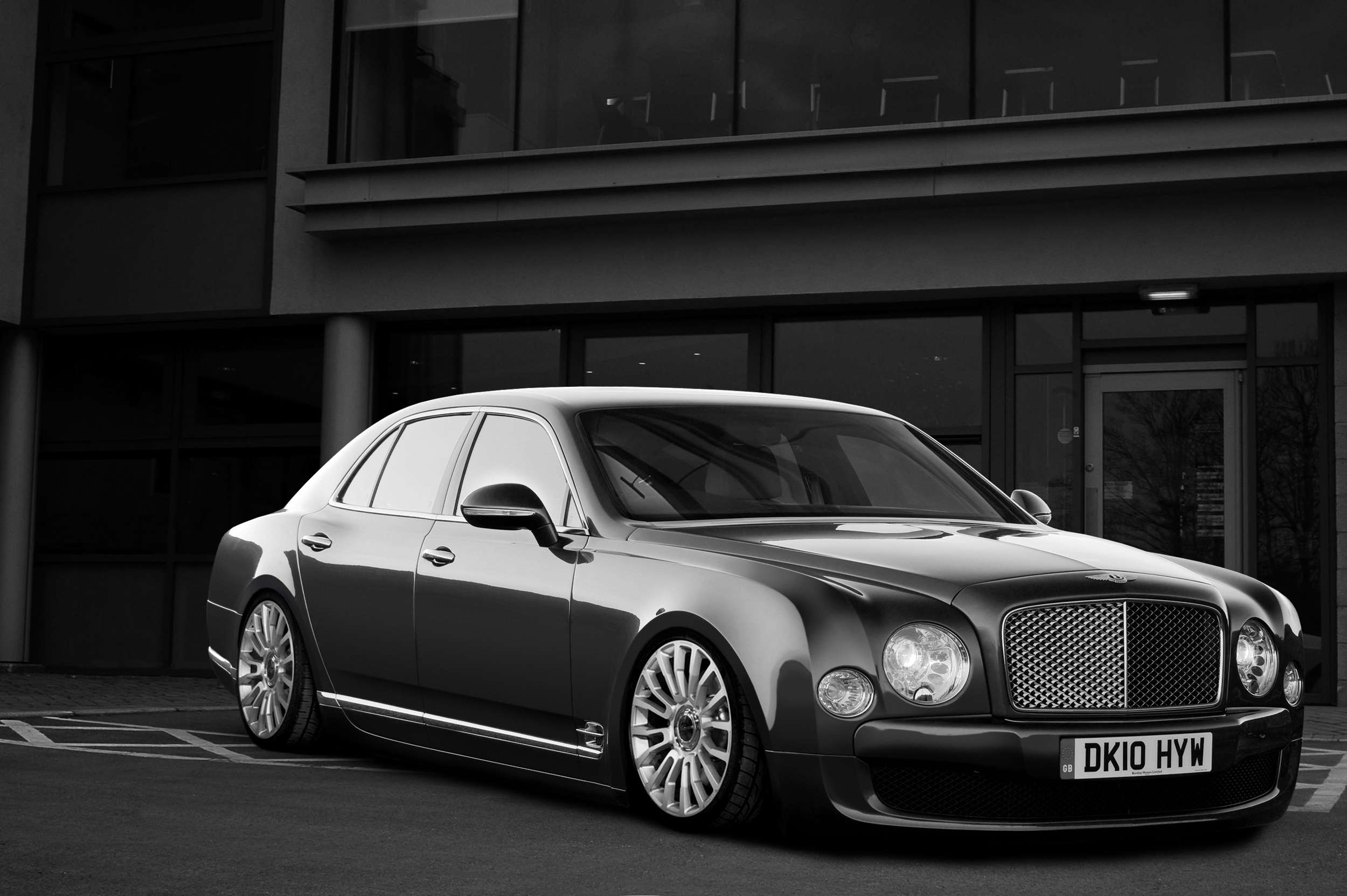

iCreate
bentleymulsanneicreatec.jpg
Zykotec
17264662_th.jpg
focusonme
10538457_th.jpg
Cipprik
19409557_th.jpg
Cop
10600979_th.jpg
T_T_f
contiscopy.jpg
sZr
17692031_th.jpg
Will_89
16313422_th.jpg
MickeyM
15221834_th.jpg
Bliznaka
18204849_th.jpg
rc82 workchop
11209583_th.jpg
rodjoo
19833179_th.jpg
Matt_K
10289720_th.jpg
Asoares
50054067.jpg
rich
15640623_th.jpg
EPP Design
13560510_th.jpg
stelistu
17578354_th.jpg
SDW MODS
10007942_th.jpg
Aero_SB
11919002_th.jpg
Goxpin
10469955_th.jpg
brownboi16
12850450_th.jpg

******* UPDATED BY MK211 ******* Two entries that got missed earlier
Tomica
I906u.jpg

TK Tuning
bentleymulsanneready160.jpg

Cheers
Joseph
Post edited May 15, 2012 at 11:23:38 PM by MK211
ffkZ5K.jpg
Come join us on Facebook and Tumblr
10 points -> Cop (DOPE)
9 pts -> Asoares (Amazing)
8 pts -> Cipprik (Awesome)
7 pts -> Matt_K (Nicely done)
6 pts -> Will_89 (Cool work)
5 pts -> T_T_f (Good work, I like headlights)
4 pts -> MickeyM (Nice work, I like colors)
3 pts -> stelistu (cool idea for front)
2 pts -> rc82 workchop (Will finish?)
1 pts -> EPP Design (Too big rivalry, still like your work)
points run out :(
Signature removed because it's too large. Read the rules about signature sizes.
10 pts - Cop
9 pts- Asoares
8 pts - SzR
7 pts - Matt_K
6 pts - rc82 workchop
5 pts - rich
4 pts - Cipprik
3 pts - MickeyM
2 pts - EPP Design
1 pts - T_T_f
My DeviantArt
My Portfolio
Facebook page
1 person liked this.
uhh.. this round don't had superb works :S I see too lots of c/p of super known donnors.

Anyway, my votes are:

10 points - Cipprik - Superb white and bodykit. Also loved the rims
9 points - Cop - By brush quality..not for creative work.. i mean, what you did, fits perfect! But for me need something more. Great background!
8 points - Srz - As i told you, love the body kit,however some tones and glass reflection are weird. Still a great chop!
7 points - Will_89 - Superb brush for you second chop? :) Is a example that a good observation do all! Still a bit purple to clean!
6 points - EPP Design - Other good example of beginner brush! Love it, great side. Don't like the rims, too huge.
5 points - Rc82 workshop - You have to agreed with me.. Don't deserve more that 5 points mate. Bad quality of rims and those headlights are poor. Still have a great style.
4 points - TK Tuning - Superb color!!!!!! love..Still a bit toon and low quality.
3 points - Matt_k - Good use of the donnor.. But don't have much creativity :\ Sorry, nothing personal. But still a great work to adapt all :D
2 points - Rich - This disappointed me a little. Refs bad quality, all chop seems you did in like 45 minutes. Don't get me wrong. But still much from the original.
1 points - Stelistu - Don't like the body kit.. Remember me a lot of the doonor eheh You could do some improvements on that. I see much of the original too. Good rims.

Zykotec , good entry but not enough :\

For the rest good luck and work more and better for next round! Dodge Challenger :D
Post edited May 15, 2012 at 11:38:27 PM by Asoares
10 points - Cipprik (very nice front bumper)
9 points - Asoares (i like wheels and bumper)
8 points - sZr (cool show style)
7 points - Matt_K (i like bodykitt)
6 points - rc82 workchop (wheels is ok)
5 points - rich (front bumper is good)
4 points - Zykotec (cool)
3 points - Will_89 (color :-d)
2 points - Cop (BG is good)
1 point - rodjoo :)
gtavs.jpg
Oooh wow - really tough this one O.o

10 Points - Asoares - One of my favourite designs of the whole round!! Couple that with lovely brushing, atmosphere and lighting and I think we have a winning chop! :D Just the ground looks kinda too blurry for me.. but well done :)
9 Points - Cipprik - Another awesome design! Absolutely love it! Perhaps even more than Asoares's design. However the rear rim looks off for me, and the shape of the car seems lost with the brightness of the paint :/
8 Points - Szr - It may have lots of copy and paste, but it's integrated really well with a mixture of brush and an epic design. The wheels and side windows are a massive let down though :/ And there are some strange colour variations around the front
7 Points - Zykotec - Really like the design for this - it's mean and aggressive, and suits it really well! Maybe the arches are a little over the top, and the brushing a little blurry but damn... that front bumper is out of this world! Love it!!
6 Points - Cop - Your brushing never fails to amaze me! A massive inspiration to me, and I'm sure many others. The green is delicious, and the subtle fb mod looks really nice. But I just find myself sat here thinking "what if... " - imagine how it would look with some crazy stance, deep dish wheels and awesome kit like some of the other entries...
5 Points - rc82workchop - design is pretty awesome tbh, and looks really mean! The dish = win, however I'm afraid the top right corner kinda sums the chop up :/ It looks good, but it seems very rushed with several low quality parts.
4 Points - T_T_f - clean and simple, but nicely stanced. The new colour suits it, and the new reflections to match the bg are a nice touch - well done :D
3 Points - Will_89 - A 4th chop??!! And a first brush?! Seriously this is incredible. If only you knew :') The attention to detail and brush quality is easily inter/pro standard in places! Overall stance looks good too - a very good chop :)
2 Points - EPP Design - Another good piece of brushwork! But for me it still feels a bit 'brushy' and unfinshed - some of the lines of the car seem to have been lost. Other than that a very cool piece of work and a very nice design :) Well done
1 Point - SDW MODS - Loved the design of this when I saw it in the showroom, and I have to admire it for the way it stands out! Totally different from any of the other entries, and actually very well executed save for a few blurry areas, but as it's posted at such a high resolution I think I can let you off with that one.

Well done to all who entered - a tough base indeed! Good luck to everyone :-d
125q72h.jpg
>>Latest Chop<<
| >>Like my Facebook Page<< | >>Basic Brushing Tutorial<<
10 pts - sZr
9 pts- Asoares
8 pts - stelistu
7 pts - T_T_f
6 pts - EPP Design
5 pts - rodjoo
4 pts - rich
3 pts - MickeyM
2 pts - Will_89
1 pts - TK Tuning
ay1m.png
10 - Cop
9 - rc82 workshop
8 - Matt_K
7 - sZr
6 - Asoares
5 - T_T_f
4 - rich
3 - Aero SB
2 - Tomica
1 - EPP Design
10 - asoares ( love the style, like the brush and love front and wheels)
9 -sZr ( like you car, nice brush, nice and agrecive bodykit, love front lights)
8 -TK Tuning ( like colours, wheels and style..."" i thing if you change BG you win this xP"")
7 - Cop ( like collour, super collour and brush, but not like wheels...)
6 - stelistu ( stile is nice, body kit is very nice, but collour is a original!! no paint, no brush... :S why?)
5 - Matt_K ( like collour and wheels, but not like this lateral in this front!! )
4 - Will_89 ( like collour and wheels, simple but beautiful ...)
3 - Cipprik ( like the style because it's similar my Bentley, brush is good, but ago wheel not good position i think !! )
2- T_T_f ( like wheels )
1 - Tomica ( very simple car, for me only change wheels and paint reflexes... )


For the rest good luck and work more and better for next round! Dodge Challenger
Thanks for votes mates , appreciate:D . My vote look like this:

10p - sZr: greatest work from this round , a bad car look . Congrats ! :D
9p - Asoares: Second design by me , it looks great; side looks kinda unfinished , no reflections looks bad :( ;
8p - Zykotec: Very nice design , but as we see , lack of mesh drags u down ...and also low res...
7p - Matt_K: Nice style and paint , but u forgot a mirror :D bad detail , but important in competition;
6p - MickeyM: Another interesting design , but i dont like the background...it doesnt fit;
5p - Cop: The cleanest work , but i expected more imagination from u...:( too bad ...
4p - rich: atmosphere looks good , design looks Chrysler , country and dusty car :D ;
3p - rc82 workchop: "why so serious ?" thats the message that i have for you. Too much dark its the answer , i suppose ;
2p - stelistu: the style that u chose , it isnt for a Bentley , but at least looks a little clean ;
1p - T_T_f: a lot of elements are low res, especially the interior.

Good luck all !
33nwdgnn.pngijc7tn5o.pngp52vc5hx.png
Back to top

Please login to post