Raver's Choice - Leon Cupra
Done as much as I thought I could on this without going too overboard. I did two versions of the final product, one with neons and one without, as I wasn't sure if I liked them or not, but I think I'll let you guys decide. C&C always welcome and appreciated.
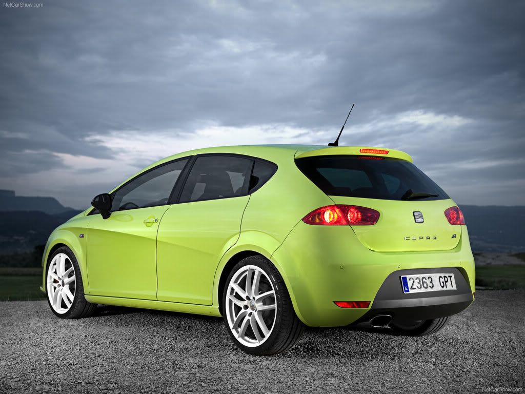
Before:
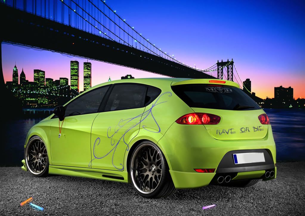
After:
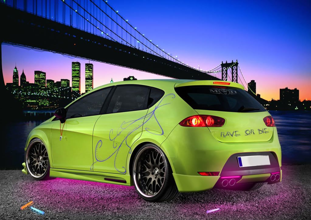
Neon Version:
Before:
After:
Neon Version: