Autemo's Nissan GT-R .:By 7DK:.
Yo! Whats up? ")
Damn! After 3 weeks and more that 300 layers, i've finally finished this GT-R!
If i were able to put the work done as percentage, i think i would say that it's 90% brushing/rebrushing and only 10% C/P.
I spent a big time on it. All the red parts were remaked and now, are with this new green color.
Don't be excited: The car recieved light modifications. I centered my attention to the quality, not to many modifications. From now on i'll try to do my chops more modified, more detailed and more well done.
Enough talking huh? Lets see it. Hope you like it people!
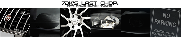
Original:

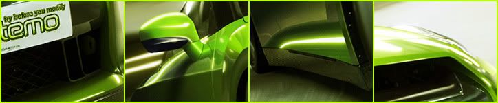
Details:
Autemo's Nissan GT-R:
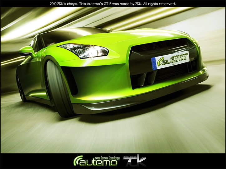
Higher Resolution (1800px): http://i297.photobucket.com/albums/mm236/_MWSR_/GTR-Autemo-final-1800px.jpg
So, i want to know your opinion! Please, your coments will be very important, since i spent a long time on it, and i gave my best rebrushing it.
Thanks in advance!
7DK
Damn! After 3 weeks and more that 300 layers, i've finally finished this GT-R!
If i were able to put the work done as percentage, i think i would say that it's 90% brushing/rebrushing and only 10% C/P.
I spent a big time on it. All the red parts were remaked and now, are with this new green color.
Don't be excited: The car recieved light modifications. I centered my attention to the quality, not to many modifications. From now on i'll try to do my chops more modified, more detailed and more well done.
Enough talking huh?
Original:
Details:
Autemo's Nissan GT-R:
Higher Resolution (1800px): http://i297.photobucket.com/albums/mm236/_MWSR_/GTR-Autemo-final-1800px.jpg
So, i want to know your opinion! Please, your coments will be very important, since i spent a long time on it, and i gave my best rebrushing it.
Thanks in advance!
7DK
Post edited August 12, 2010 at 11:05:06 AM by 7DK