How it Works
Example Work
Autemo Design Blog
Contact Us
Artist Login
All forums
Novice Artists
seat leon st
ahmed2000
Posts: 383
Pro Tuner Artist
Global Rank: 0
th
(7093pts)
Reg: Aug, 2014
Egypt
seat leon st
#
1
Posted June 01, 2015 at 12:30:50 PM
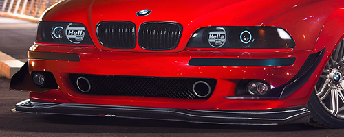
my work in Novice Competition
what do you think guys ??
base:
chop:
sorry for my bad English
0.00
(0 votes)
ahmed2000
Posts: 383
Pro Tuner Artist
Global Rank: 0
th
(7093pts)
Reg: Aug, 2014
Egypt
#
2
Posted June 01, 2015 at 11:41:17 PM
nothing
sorry for my bad English
nordic man
Posts: 3331
Elite Artist
Global Rank: 0
th
(12484pts)
Reg: Aug, 2009
Finland
#
3
Posted June 02, 2015 at 12:01:13 AM
ideawise it is nice but i think it is bit too saturated or some other effect layed on top of it?
the quality of the image (mostly paint in rear and the wheels) suffer from it
styling is cool though
keep working man
rain prisk
Posts: 415
Pro Tuner Artist
Global Rank: 0
th
(5928pts)
Reg: Dec, 2009
Estonia
#
4
Posted June 02, 2015 at 02:47:29 AM
The red-blue color combo looks very cool and I like the style of the chop.
Have to agree with nordic, it looks a bit too contrasted or saturated.
facebook.com/rainprisk
|
rainprisk.deviantart.com
ahmed2000
Posts: 383
Pro Tuner Artist
Global Rank: 0
th
(7093pts)
Reg: Aug, 2014
Egypt
#
5
Posted June 02, 2015 at 04:31:37 AM
but guys how i can fix it ??
sorry for my bad English
Back to top
Please login to post