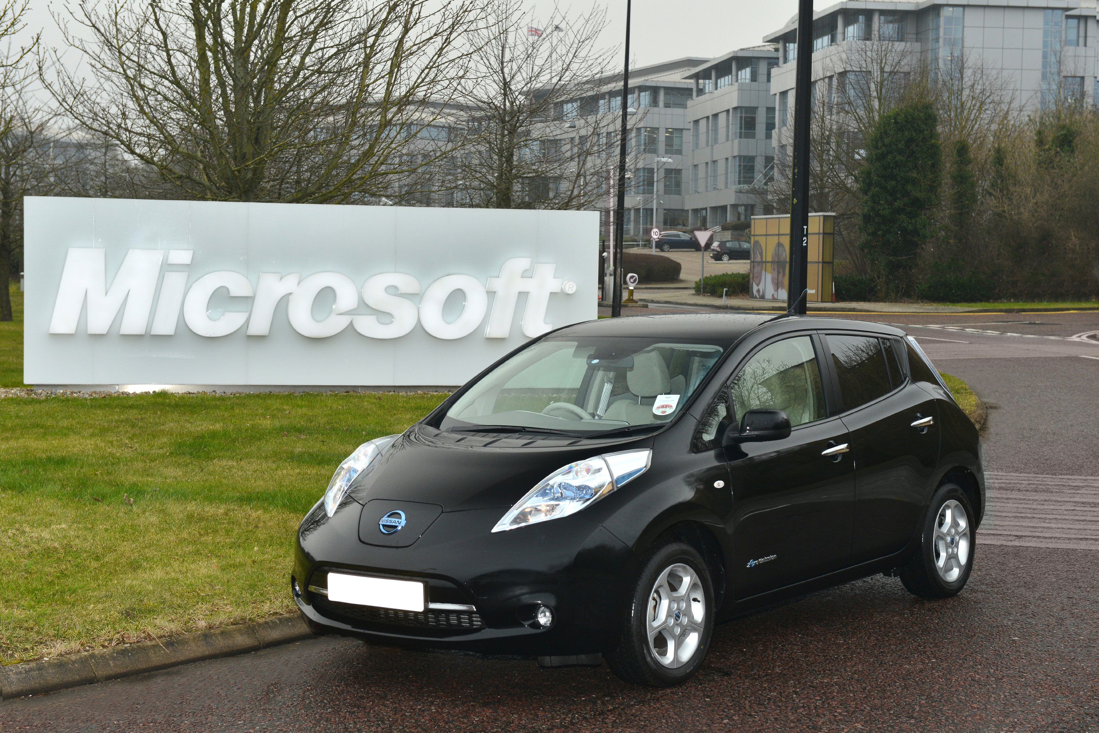
Nissan Leaf Classic Round5

I will be present at the Classic Round 5 chop with this ;) hope you like it.
Base:
14660378.jpg
Chop:
autemoluglioMOD.jpg
Wip: wipleaf.jpg
Post edited July 23, 2013 at 06:49:34 AM by ddd racing
0.00 (0 votes)
1 person liked this.
Doh!
It looks amazing if i only check out the little pic, but the HiRes is really low on details.
Too bad, because the atmosphere was so nice.
Keep an eye on the deatils, on the markings.
http://vinyo.deviantart.com/
https://www.instagram.com/vinyometaldesign/
Vinyo wrote:
Doh!
It looks amazing if i only check out the little pic, but the HiRes is really low on details.
Too bad, because the atmosphere was so nice.
Keep an eye on the deatils, on the markings.
I do not know in my pc the HD looks good, do not know, anyway thanks for the comment.
PS: I want more comments and votes also
I'm really confused :S
Why have you posted the HD twice? You've posted it visible in the thread first, and then linked to the exact same image :S So I end up loading the full resolution image twice.

The point of a HiRes link is so that you post an 800x600 preview in the thread to load quickly, then link to the full size to view details - please do this in future :-d

As for the chop...
I agree with what vinyo said, the full size lacks in detail somewhat, and feels a little untidy - take the rear arch for example - the curve isn't round, and it has a very sharp edge, and lots of very sharp reflections. This contrasts greatly with the side which is blurry from the copy and past and distortion
There is also some inconsistency in the reflections on the chop - the front arch is a very similar shape tot he rear, and so should have very similar reflections. You also have to bear in mind that none of the arch surface points in the same direction as the side of the car, so the reflections should not flow on the same, but be completely different.

Despite these mistakes it's a very good chop - this is all part of learning to chop :D and you are improving. There are lots of good things on this piece, including a creative kit design that fits well, a nicely fitted backdrop and set of rims and a very nice atmosphere

Well done! Keep going :-d
125q72h.jpg
>>Latest Chop<<
| >>Like my Facebook Page<< | >>Basic Brushing Tutorial<<
ATC Design wrote:
I'm really confused :S
Why have you posted the HD twice? You've posted it visible in the thread first, and then linked to the exact same image :S So I end up loading the full resolution image twice.

The point of a HiRes link is so that you post an 800x600 preview in the thread to load quickly, then link to the full size to view details - please do this in future :-d

As for the chop...
I agree with what vinyo said, the full size lacks in detail somewhat, and feels a little untidy - take the rear arch for example - the curve isn't round, and it has a very sharp edge, and lots of very sharp reflections. This contrasts greatly with the side which is blurry from the copy and past and distortion
There is also some inconsistency in the reflections on the chop - the front arch is a very similar shape tot he rear, and so should have very similar reflections. You also have to bear in mind that none of the arch surface points in the same direction as the side of the car, so the reflections should not flow on the same, but be completely different.

Despite these mistakes it's a very good chop - this is all part of learning to chop :D and you are improving. There are lots of good things on this piece, including a creative kit design that fits well, a nicely fitted backdrop and set of rims and a very nice atmosphere

Well done! Keep going :-d
expecting a comment, however for the reflections I made from a counselor tuner well known on this site that's why I made them so, but nevertheless are satisfied with the result because I used 85% of the brush and the kit has created great part of me as I wanted to, not instead once I created nothing .....
Back to top

Please login to post