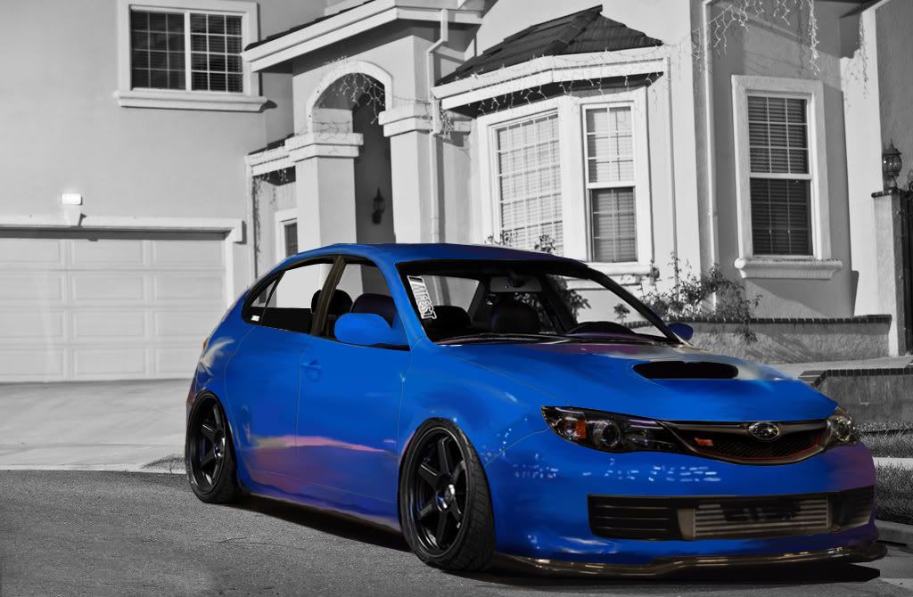
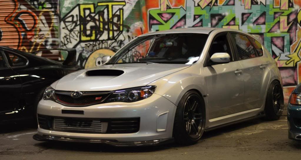
Subaru Impreza

I decided to do something in the meantime while I am working on the BMW so I decided to something a little more- easy? And well, this may look rough, but I am still trying to find my way of brushing and working. So please, let me know what you think :).

2.jpg
416389_377362088980750_106576446059317_1085298_1089643872_o.jpg
I prefer engine oil and overalls to nail polish and fashion any day♥
7.00 (4 votes)
Sweet work Kate, it's good to see you doing something out of your comfort zone. The speedpainted effect looks pretty nice, and the paint looks gorgeous. I'd work on keeping your lines sharp and smooth though as the painted effect is one which suits organic things - humans, wildlife. When it comes to machinery and precision instruments, you need to make sure you go back and sharpen things up. The first thing you want to get across to the viewer is the harshness and edginess of the metal, then use the painted effect to work with reflections etc on top of that.

Be careful where your tyres meet your arches too, it could be a little smoother.

Great work though, and a big improvement from your other stuff.

9/10
Hello.
I agree with jack. Overall effect is cool, but there are some areas that you need to work on, generally just tidying it up:
  • Seem to be a lot of jagged edges, and edges which aren't really curved, make sure you're using the pen tool with a 0.3 feather, and make sure that all of your paths flow neatly together, this will help create a big improvement. If any jaggies are there at the end on the edges, just select with pen tool again and hit delete
  • Use the 'stroke path' feature with the pen tool to create the smooth flowing lines and reflections for certain areas, like the highlight on the lower door, just go around the edge and stroke it, it'll help neaten it up
  • Door lines need to be a lot darker, and the highlight on them should be on the opposite side of the black bit ;)
  • Wheels are of a very low quality, and the front tyre looks really distorted
  • All the logos are reversed xD except for the MFEST one - what's that doing there anyway? ;)
Despite the errors it still looks rather cool - you've done well to capture the atmosphere and lighting of the paint and your work's been progressing nicely recently :)
Keep it up :D
125q72h.jpg
>>Latest Chop<<
| >>Like my Facebook Page<< | >>Basic Brushing Tutorial<<
To expand on what Andy said ^

Only use a 0.3 feather if you're working on a document 3000px + in width

0.2 if 2000px +
0.1 if 1000px +

I find that garners the best results so your edges aren't too sharp or too soft.
Hello.
katei.jpg

Hello Kate,
I like the style but there are many errors that usually you do not, these are the most obvious:
1) The two mirrors are of different size and shape;
2) The paint is hurt shown in a clear manner;
3) The area of the radiator is blurred;
4) The front wheel is attached to the asphalt
signatureim.jpg
Wonder why no one mentioned how off is the car sitting in that bg? It's totally off for the lighting/ atmosphere/ reflections. Also there are many unfinished areas, such as the one on the side mirror for example. Why don't you spend more time on small details and tidying up the selections instead?

Good try for the brushing, but needs a lot more effort on finishing.
:awesome:
dA
you did made something good and well with more practice you will become one kickass artist :D and yeah mistakes have been already told
Back to top

Please login to post