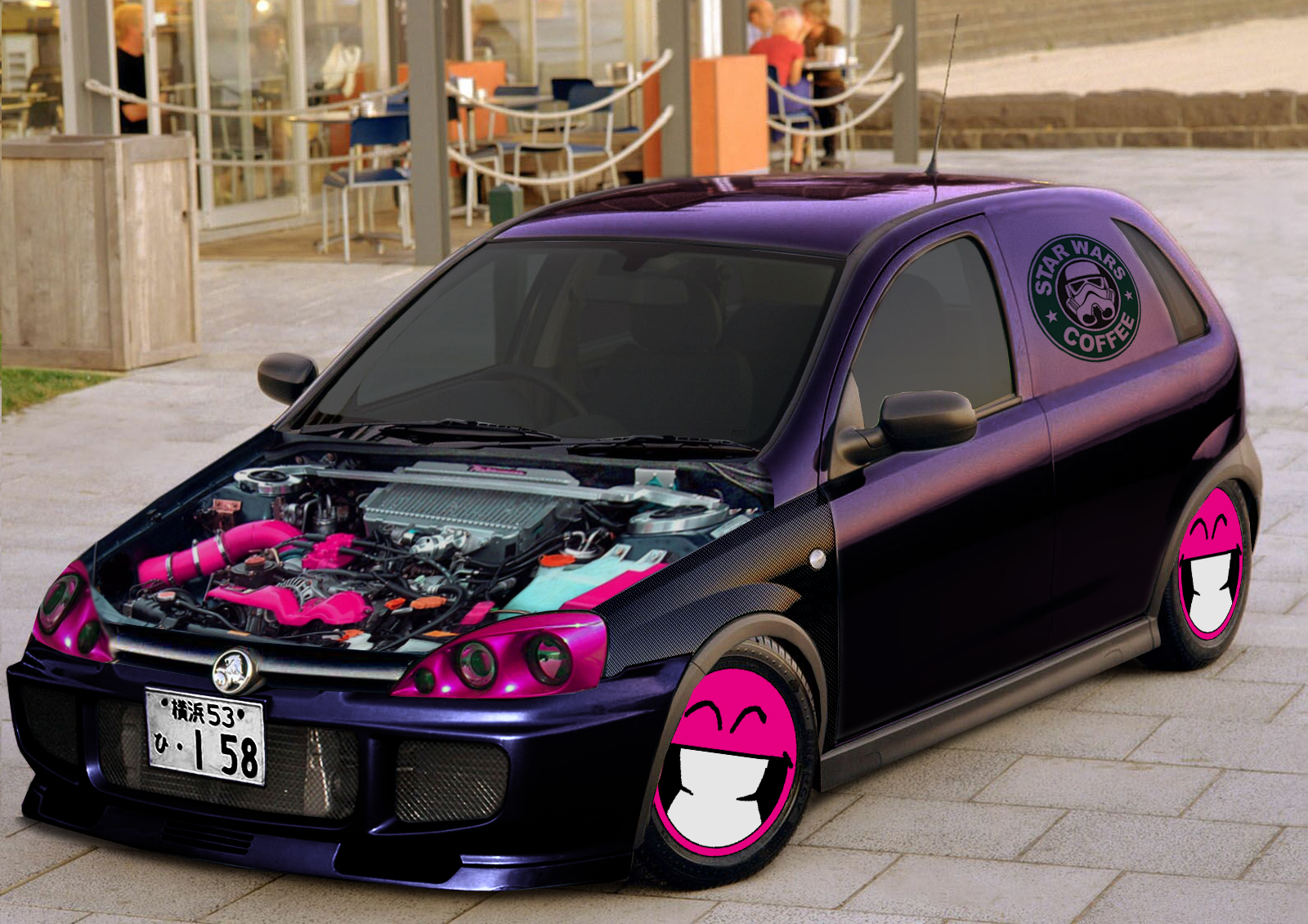
the parts used are a bit to much different in quality and like the far side headlight is to distorted.
the actual coffe logo is totally out of perspective ..
so you def need to work on angles / perspectives and finding the right parts
to make it van like i would not have kept the small rear window but made that all shut
def. totally love the wheel idea


it could be improved my getting some pepth in the discs and make it look more like moon discs with a mot of shape in it and maybe like botls or tie-wraps so it looks like its fixed to the steel wheel behind it
you could have used the ori hubcaps for that and like brush the holes away and remove the logo in the center (but keep that hight difference there) and then overlay the smily with a bit effect
so nice job , all thingsmentioned are helpfull not to flame or call out as many mistakes as i cant find
the smily disc idea is wicked , wold love to do something with that one day myself

Post edited January 07, 2012 at 08:11:55 AM by rich

.jpg)