Cool ideas
")
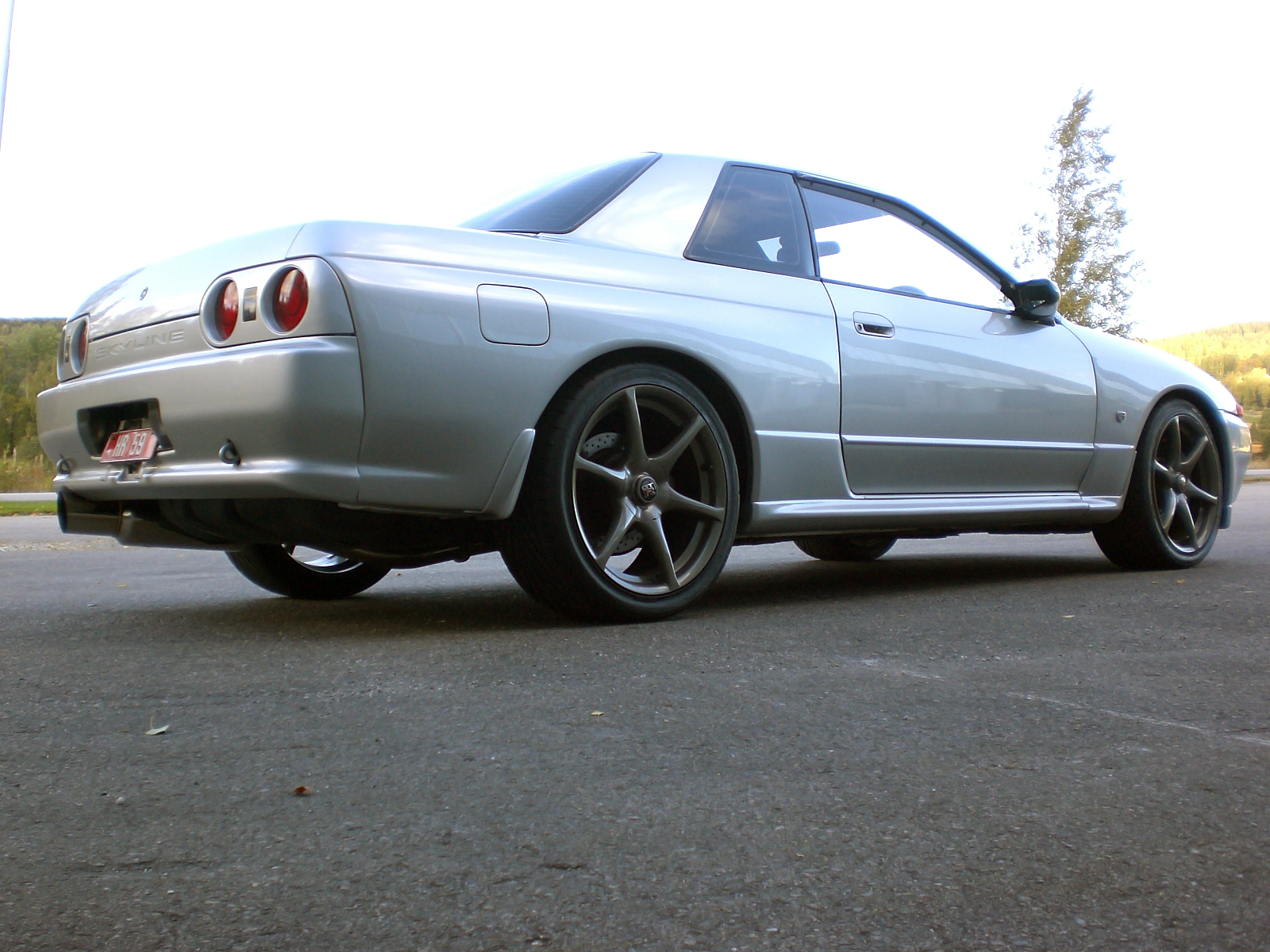
But there are mistakes, even on the update
With the new bg through the window - you shouldn't just leave this plane, but add some low opacity block colour, so that it looks like it is showing through the window reflections and window. Also make sure your selections are neat, and right up to the edge! Otherwise you are left with that white outline.
The angle of the bg is slightly off, and the whole thing, even on this low resolution looks very blurry and low quality, which kind of spoils the whole thing

As for the rims - they fit well and look cool
I'm not sure the indoor lighting on them quite works but oh well
The stickers are a nice addition to this chop, and I hope you do well in the competition. Good luck

Post edited November 01, 2011 at 02:34:37 AM by ATC Design