I can see you are making alot of chops lately, which is great.
But there are alot of simple errors on the car.
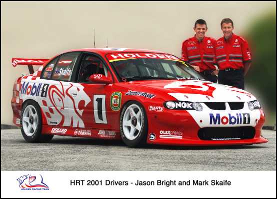
First thing would be the arches and the whole car, they are very roughly traced out.
Have a look into learning to use
pen tool when you are tracing out the car, it will give a much better result and faster too.
As for the Mobile 1 logos, im not sure why the look squiggly, it should instead follow the shape of the body of the car. so take some time to stud the shape of the car, and how the logos should bend to follow the car.
The color of the car is too saturated, so lower the saturation of the red, make it darker and add a touch of contrast.
WIndow's of the car looks too greyish, make them brighter and add more contrast to make it look more appealing.
Just remember to pay attention to detail and try to make everything perfect, such as deleting the white areas from the car vinyl so it doesn't look messy and take some time to look closely at photos of real cars and try to replicate them and aim for realism.
Also have a look into the
tutorial section, plenty of great tips there
But I recalled you saying you dont have photoshop, so that may be an issus

Keep on chopping and good luck

Post edited October 10, 2011 at 03:56:36 PM by J_HUI