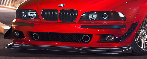
8/10 Is a bit too high for such a chop (i'm sorry but its true)...the colors are flat, the contrast of the car is miles of the contrast of the background, the dark windscreen should be reflecting the surroundings but it doesn't, the shark sticker/brush thing added is hideous (the idea isnt but the execution is!

it doesnt bend around the car, it doesnt follow the shape of the car, it looks like its floating on the image! The car's left side (our right side) is missing through the window, its as if you cut it off when changing the bg, there are no shadows of the car on the ground given that the main light source of the bg is coming from behind the vehicle! The wheels (just the like the whole car and image) lack the consistency of contrast with the image, they dont match at all!
Sorry mate but this is quite below par....keep practicing and use the
Work In Progress forum on here as you go along with a chop to get feedback, also check the tutorials forum on how to do the basics in chopping!
good luck and like i said, just keep practicing!


