Karvette - C4 contest entry
Here's my first contest entry here, and my very first attempt at altering a quarter-view image.
With this edit I was aiming for the possibility of a SuperSport production version.
This is what I did to it;
Wheels and side mirrors changed to black color.
Darkened brightness of front turn signals and corrected for glare over front end.
Rear pillar was doubled to create side vent with grille screen added, and rear window adjusted to fit.
Side marker lights were narrowed with front light repositioned lower.
Black trim molding adjusted at door jams and wheel wells.
Created break in front trim molding and corrected lower gap in license plate cover.
Door handle was shortened and lengthened.
Faux fender vent louvers were moved to door with 3rd one added.
Roof blackened to resemble matte vinyl roof.
Removed hood logo, replaced with logo on fender with SuperSport 'SS' logo and '572' emblem added.
SuperSport lettering added to seats.
Hood contours raised up slightly, changed to black color with vent scoops added.
Corvette logo with flames added as 'ghost' hood decal below hood vent scoops.
Side rocker panels darkened, and SuperSport lettering added.
Rear fender flair tilted out slightly at top with widened rear tire.
Headlights spit into dual pop-up design for separate Hi-Lo beam.
Removed 3rd tail light from roof, presume sunken into body.
Added shading to windshield and side window.
Corvette concept race car and hazard cones added to background.
Background 'fog' shading and foreground colored illumination added.
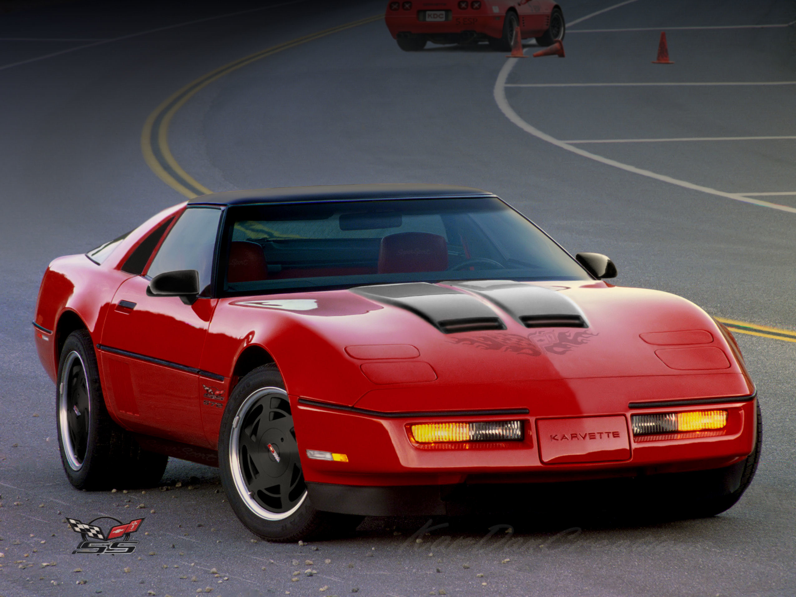
Thanks for looking...
With this edit I was aiming for the possibility of a SuperSport production version.
This is what I did to it;
Wheels and side mirrors changed to black color.
Darkened brightness of front turn signals and corrected for glare over front end.
Rear pillar was doubled to create side vent with grille screen added, and rear window adjusted to fit.
Side marker lights were narrowed with front light repositioned lower.
Black trim molding adjusted at door jams and wheel wells.
Created break in front trim molding and corrected lower gap in license plate cover.
Door handle was shortened and lengthened.
Faux fender vent louvers were moved to door with 3rd one added.
Roof blackened to resemble matte vinyl roof.
Removed hood logo, replaced with logo on fender with SuperSport 'SS' logo and '572' emblem added.
SuperSport lettering added to seats.
Hood contours raised up slightly, changed to black color with vent scoops added.
Corvette logo with flames added as 'ghost' hood decal below hood vent scoops.
Side rocker panels darkened, and SuperSport lettering added.
Rear fender flair tilted out slightly at top with widened rear tire.
Headlights spit into dual pop-up design for separate Hi-Lo beam.
Removed 3rd tail light from roof, presume sunken into body.
Added shading to windshield and side window.
Corvette concept race car and hazard cones added to background.
Background 'fog' shading and foreground colored illumination added.
Thanks for looking...