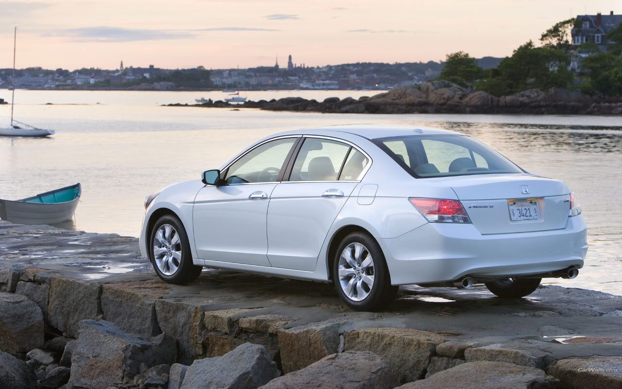
Oh that looks sweet! Quite a lot of quality issues that we will get to later, but I love the fact that you have managed to pull off this brush

If we start with the design I like what you have done to it. The sideskirt and new back and front spoilers really give the car a nice sporty feel without being over the top. Feels Audi RSish for some reason. Also like that you made it into a two door coupe, but I had liked you to have made the car a bit shorter on the middle, now the car looks so long for being a two door. I can still buy the conversion however, but would have liked to have seen another angle on the back door line. It's a bit straight, I base this on the fact that almost all bodylines on the car have a small curve on them. The color of the car looks great with that marine blue on the side, just wished you had managed to get that gloss in more places, but we'll get to that later. The rims are a perfect choice. They are clearly aftermarket, but fit with the style and still have somewhat of an OEM touch to them which fits the car really well. Overall great.
If we look at the quality, there is quite a lot to be desired unfortunantly. The main issue that appears over the entire chop is that the brush is blurry. There are different ways of fixing this. The Nordic man way using the smudgetool, which few master

Or the brush way with a brush with low opacity and various sices. There are some areas like the widebody quarters however that could have been fixed with a nice smoth path and brush against. But it still looks okey. Then there is the colors in the paint. In some areas it looks great, but in others it's just the wrong color in the wrong place. Dunno if you used a donor? But you should have studied a bit further. But in general, on the back at least, the color is to bright. I think the only solution would be a nice rebrush unfortunantly.
Overall this is great! You are improving fast, and it takes balls to do a full brush like this

So keep it up and you will advance in no time!
Cheers!
 Anyways thought i'd finish this one, and make a even better chop. Anyways the whole body is 100% Brushed.


