Infiniti G35

Most of u guys saw my entry for round 2
there vere some minor mistakes, now they are fixed tnx to X-Raited Creations and on his Constructive comment
here is that link from his comment i.imgur.com/9FBGx4z.jpg
this is an update with an old version of my entry
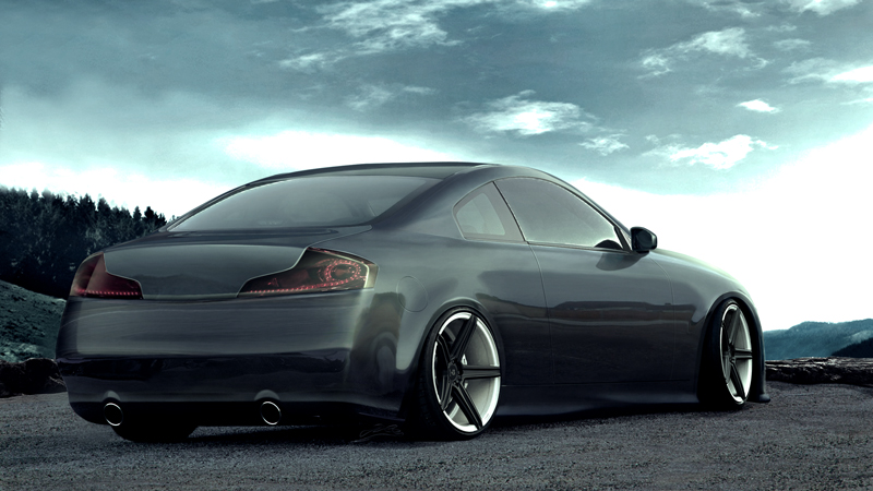
g35_2.jpg

HR
http://www.upload.ee/image/3180069/g35.jpg
HR of old version
http://www.upload.ee/image/3143301/baseimage122412.jpg

My old post is deleted
so commentc and critics are more than welcome so as the rating stars
regards
gile

logo_copy.png

CLICK TO VISIT MY PROFILE
>>>FORUM SIGNATURE TUTORIAL>>>MY LATEST CHOP>>>
10.00 (2 votes)
1 person liked this.
muuuuuuuuuuch better now!
didn't like he first version and thought: ough :-q

but with the bugfix and the new color-touch it's still perfect :)
avaaaaaeos30.png
Tnx m8
would be great if this one is in the competition not that old version
but cant update it now it is to late for that :D

logo_copy.png

CLICK TO VISIT MY PROFILE
>>>FORUM SIGNATURE TUTORIAL>>>MY LATEST CHOP>>>
i agree the new update is much better compare to previous one, only thing that bugs me is the side looks a bit straight maybe if you add little bit more lines it would go away, other than that awsome chop mate :-d
qPr0RCb.jpg
1 person liked this.
Wowzers - where have you been hiding this? XD
I must say, it's a very well executed chop, with some nice brushing and atmosphere

Very few errors too, I'd say the biggest thing stopping this being a truely awesome chop is the door lines - they seem to faint, and sort of let the other reflections show through too much - try and make these a little more defined and noticable

Something else that would help, would be to distort the reflections a little where they meet the door line - right now it seems as though they flow straight across which looks a little fake

Other than that very well done :-d This looks better than the "old version" and seems to be pulled together much more nicely on the whole, with a good choice of backdrop and rims
Keep up with the good work :D
125q72h.jpg
>>Latest Chop<<
| >>Like my Facebook Page<< | >>Basic Brushing Tutorial<<
ATC Design wrote:
Wowzers - where have you been hiding this? XD
I must say, it's a very well executed chop, with some nice brushing and atmosphere

Very few errors too, I'd say the biggest thing stopping this being a truely awesome chop is the door lines - they seem to faint, and sort of let the other reflections show through too much - try and make these a little more defined and noticable

Something else that would help, would be to distort the reflections a little where they meet the door line - right now it seems as though they flow straight across which looks a little fake

Other than that very well done :-d This looks better than the "old version" and seems to be pulled together much more nicely on the whole, with a good choice of backdrop and rims
Keep up with the good work :D
Really tnx on feedback ATC
and i will have those things on my mind on next chop
- door lines
- and distorted refs
really tnx
all of your comments are well appreciated

logo_copy.png

CLICK TO VISIT MY PROFILE
>>>FORUM SIGNATURE TUTORIAL>>>MY LATEST CHOP>>>
Back to top

Please login to post