Audi A7 SUMMER LOVIN - Kalandos.

Did this in 1 day, I've already chopped the base but I think this one is better :)

a lot of things have been modified so please look carefully :) side is brushed, hood is brushed, other parts are brushed to fit the car, copy and paste are the obvious things..

lets hope this chop gets comments not like my last one :/

original
385453_10150390222934075_674494074_8388376_1915366815_n-1.jpg

chop
ams74w.jpg
^ open in new window for HR

UPDATE:
m927id.jpg
Post edited January 24, 2012 at 06:09:21 AM by Kalandos
sigferrari.jpg
9.00 (3 votes)
1 person liked this.
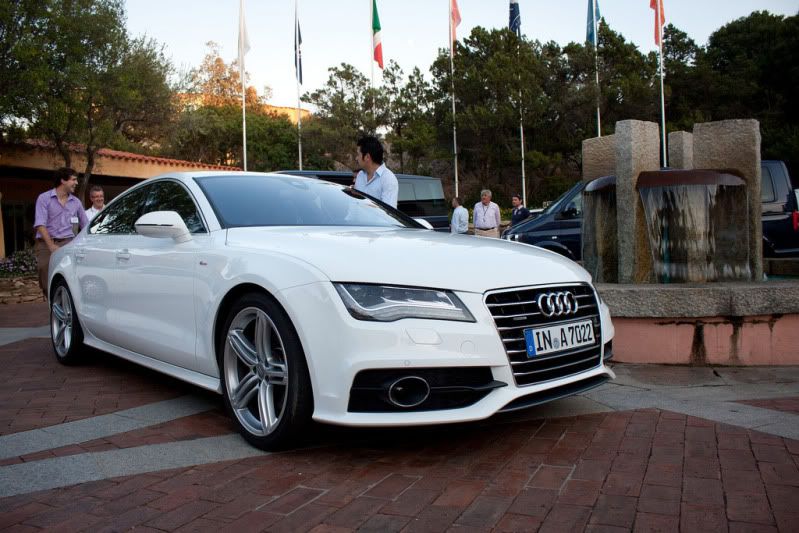
This looks absolutely awesome! I really love the style, it's something I wasn't expecting when I first opened it up. There's only one, maybe 2 things that I can see as mistakes.

1: the shadow directly under the car is too dark and too sharp. The penumbral shadow (the second one that strays far from the base of the car) is perfectly done, and should be sharp, but the one underneath should be shaped better, a bit more accurate around the wheels, fade more as it gets close to the edge, and not as sharp and dark.

2: the reflection on the side window shows what I assume is a building, but we can't see any buildings. Of course, it could be reflecting something that we can't see form this angle, so it's not really a mistake :)

Style wise, I would have chosen better/different rims. These ones are very over-used! I've been working with HRE P40S wheels a lot lately and it just so happens I think something more like them in a solid black/white/gold would go really nicely with the style.

I'd also love to see the headlights turned off, OR keep them turned on but have the lights defined a bit more showing each LED, with more bloom around them, just to make them look a little more atmospheric. At the moment, they're really small, bright and soft, like you just used a white brush to create them.

A clean version with no stickers, and a black grille and badge would look sweet with the new rims I suggested in my opinion, but everyone has different tastes! The work itself has been done very nicely, and if it wasn't for the shadow problem I would promote you to Pro! Fix the shadow and pm me, and I'll promote you.

**featured on Facebook**

9/10
Hello.
thanks jack! ill take your comments and i will make an update now :)

edit: it has been updated, you are right it does look much better like this!
Post edited January 24, 2012 at 06:05:32 AM by Kalandos
sigferrari.jpg
Promoted! Awesome work buddy, nice to see you took criticism well. The update looks epic.
Hello.
everything jack said is absolutly right, I just think for it to look even better you sould change the windshield reflections. In my opinion it should reflect more sky, and just a bit of the trees behind it. anyway, awesome chop, love the style. And congratz on promotion ;)
79513086.png
1 person liked this.
jackdarton wrote:
Promoted! Awesome work buddy, nice to see you took criticism well. The update looks epic.

not to be the bad guy but you based this on a 984 x 683 ish pic. i cant see a larger hr than that

dont get me wrong i think it looks cool and is a very nice chop ..

not ment like i'm against the promotion , no i'm not :)

just saying i can really see the quality and work done on such a small pic (yes i copyed and pasted the link)

i can also see most is from one donor , witch is def. not a bad thing but well going from the size available and the technique imo you guys should look more on this forum because there are more people who deserve promotions

not only ounce in a while look and think oh looks cool and hit promote

(no offense)

and sorry kalandos not ment badly towards you , cool chop imo this one .. :-d
mijnlogo.jpg
Hr very small but the chop seems cool ;)
Nice chop :-d
sigb2.png
Flo2a-création facebook page : http://www.facebook.com/pages/Flo2a-photoshop-cr%C3%A9ation/210883945613455
The styling is awesome and it looks super realistic. Something I'd love to see done more often in the chopping community (as a change-up to the regular list of "stance" chops XD)

The problems I see:
- The front area of the car seems a little bright and flat to me
- Front and side windows feature refs that don't really suit the background

What I like:
- The unique styling and kit
- Your quick response and correction of Jack's suggestions

Keep up the great work! You'd be a suitable addition to Team Australia in the WTB 2012! :-d
puszka321 wrote:
please video xD
MK211 wrote:
I really like the nos coming out of the rims
so realistic m8 ! that's nice ! :-d
thanks for the comments and compliments guys, means a lot :)
sigferrari.jpg
Back to top

Please login to post