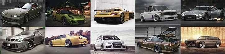
Wow nice color scheme very show car like, i love it :D
I also like the see through boot, which i've seen before on your Seat chop.

Only thing that bother's me a little is the rear diffuser and inside car system (ice) is a tad toony, it could use a bit more reflections.
Still an awesome chop. :-d

(but I'm surprised your still Inter o.O :( , because it think your chops are awesome, like the S15, Supra and even a Dacia Sandero xD)
ffkZ5K.jpg
Come join us on Facebook and Tumblr
Thnx :)
i don't think that the ICE in the trunk must have refs. The speakers are from an not-reflective material. And the painted area from the trunk is not in the direct light. The light enter thru that plexi glass, whitc make a diffuse light. I think :P

and dunno, i'm not the one whit those dicisions. I just wait for someone to promote me :)
Looks very, very good. But you could find better background, this looks veeeeryyy booooooriiing xD
for me nice design, no like color , toon
pretty cool chop =O
in a way imo the car needs to be more connected to the bg
i would not have used the damn balloon , that makes the chop kinda tacky , childisch (no offense)
with a tiny bit less yellow tone in the paint and a colored filter it would really come out even better
i really dig the looks and design
on the hr i find the rims a bit sharp and some parts could be less toony

but very cool chop :-d


here is am example of what i mean >

10 minutes work

1. the car more in the foreground , no person
2. darker environment with a warm color filter

now you really can see what i ment what i saw on the hr the rims are soo sharp , with rims in the same quality as the car it would be perfect
when the pic is very light and small it does not show with more warm colors and contrast it really shows the rims are a sort of oversharp

imo something like this or maybe a less tad brown filtered but... with new rims would be perfect :-d
the car looks more part of the bg and pretty realistic right ??

cabriogtmc.jpg
mijnlogo.jpg
xD FUZL my bad, I don't mean the Sub woofers them self, i mean the sub enclosure, the bit around it.
But Never mind though, turns out I was just trying to be picky and I was wrong, Lol

Also I reckon, no one here, is screaming "PRO" because of the atmosphere. The chop it self is awesome, But it needs some sort of dark contrasted background IMO, so that the paint of the car would stand out.

Hope you dont mind me stealing you chop for this:
FUZLBG.jpg
Because back in the old VM you tough me a lot, via your extensive C&C's, So I really cant think of a reason, how I could be in pro and your not :(, as I think your chop quality is 1000x better then mine xD

so give it a BG change and i'll vote to promote straight away.
ffkZ5K.jpg
Come join us on Facebook and Tumblr
hmm nice chop, i prefer the original but thats me :)
nice brushing and design but the wheels are aweful
i dont understand why you got a yellow bit on the boot on one side but not the other aswell
also i agree with rich, add colour filter, remove person and change rims then it'll be pretty nice
awesome chop! but I think that the windows from side are a bit to big, would look better with chop top (my opinion)...anyway is a cool chop!Great job! :)
70064251.jpg
AWESOME...IMO you deserve pro..
nice job my friend
Awesome colors and wheels.
Brushing is good too.
Bravo!!! Very nice chop.
WTB 2011 - Team Bulgaria 1
Back to top

Please login to post