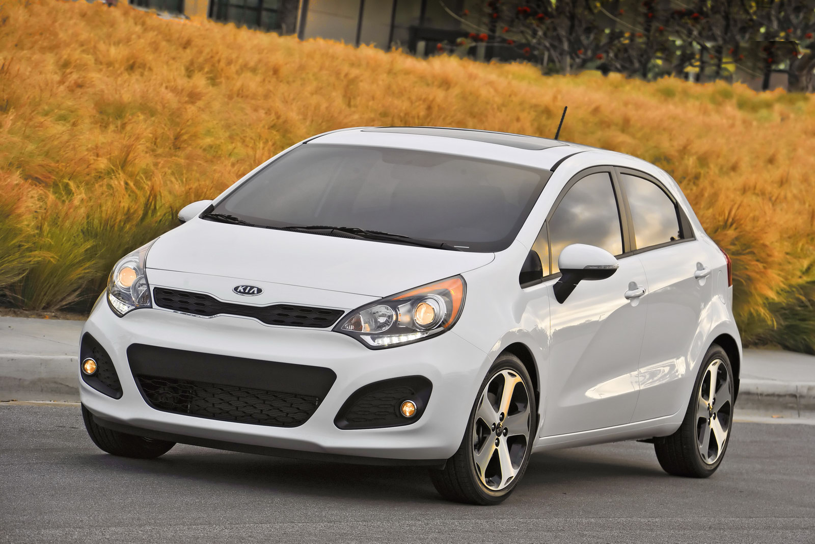
Kia Rio comp

my entry

+10hours
all brush
rims c/p
in my thinking, is my best work until now.

base:
15628790.jpg

chop
42953209115312d7fb24o.jpg

HD:
[IMG=http://img826.imageshack.us/img826/3619/42953209115312d7fb24o.jpg][/IMG]
[img]http://principediscos.files.wordpress.com/2013/12/facebook_black.png?w=48&h=48[/img]
7.60 (5 votes)
Pros:
Nice brushing, nice rims, cool background.

Cons:
It's too toony, even for a matte colour. It looks more like an Astra than a Rio, why did you change the headlights? Rims are too bright for the background and shadow is very wrong. Seats are off. And you don't have a car reflection in the water.

I don't mean anything harsh, so no hard feelings, this is my opinion and I hope you'll take more care for the details in the future. :)

55298317.jpg
Casanova wrote:
Pros:
Nice brushing, nice rims, cool background.

Cons:
It's too toony, even for a matte colour. It looks more like an Astra than a Rio, why did you change the headlights? Rims are too bright for the background and shadow is very wrong. Seats are off. And you don't have a car reflection in the water.

I don't mean anything harsh, so no hard feelings, this is my opinion and I hope you'll take more care for the details in the future. :)

+1
http://nisambudan.deviantart.com
https://www.instagram.com/enworks.digital/
For me, the new highlights are really beautiful, but I agree with Casanova
gDq8RTH.png
DEVIANTART ---> http://teofilodesign.deviantart.com/
FACEBOOK ---> https://www.facebook.com/pages/TeofiloDesign/1428153794120016?ref=hl
FLICKR ---> http://www.flickr.com/photos/99049119@N07/
YOUTUBE ---> https://www.youtube.com/channel/UCtRlFSchgzeUCXSXVJu3aOw
the car is very toon, yellow hues of the lighthouse are unreal and the interior I would have cared more, but despite that I really like the kit.
i like... nice project tuga :D
really nice color and BG. Love the rims also.

But have small mistakes.. the fronts parts (IC and tubes) are toony... need more work on it and brights.
Nice chop, I am agree with critics :)
83765749.png
The chop is nice but toon..
Very nice chop, I like your ideas alot. But I feel like the paint it a little bit toony. Is it meant to be a matte color? If so, it should be more blurred. This looks like gloss, and if it is - it needs more reflections.

Styling is good, and yes- I can see where Casanova is coming from slightly, ahaha. Nice work though, looks good- only the paint lets it down for me :)
I prefer engine oil and overalls to nail polish and fashion any day♥
Back to top

Please login to post