Global Rank: 0th (35373pts)
Reg: May, 2010
United Kingdom
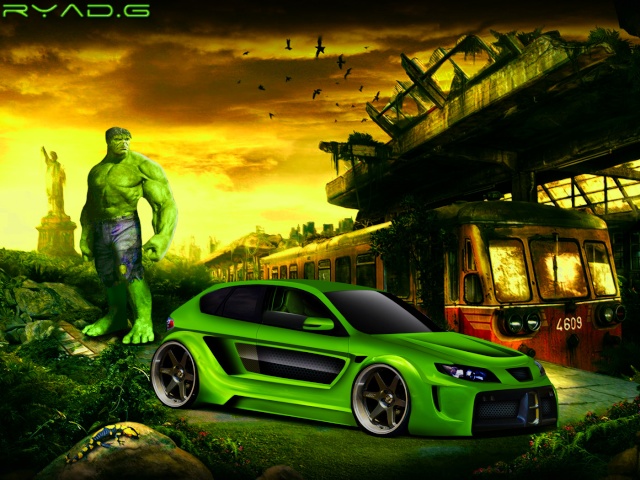
Woah this is mad  Insane design!
I really like the wideness, and the general brushing quality and style is good - just in the wrong colours!
This means that it ends up with a slightly over saturated look
To fix this you need lighter/brighter highlights, and dark green shadows - not black, but dark green
The only other problem is the backdrop - it looks off to me, and the hulk and the train look far too big compared to the car
But overall a cool chop Keep up your cool designs
I really like the wideness, and the general brushing quality and style is good - just in the wrong colours!
This means that it ends up with a slightly over saturated look
To fix this you need lighter/brighter highlights, and dark green shadows - not black, but dark green
The only other problem is the backdrop - it looks off to me, and the hulk and the train look far too big compared to the car
But overall a cool chop
Global Rank: 0th (24441pts)
Reg: Jul, 2011
Indonesia
Global Rank: 0th (1708pts)
Reg: Aug, 2011
Algeria
Global Rank: 0th (10826pts)
Reg: Sep, 2011
Spain
Global Rank: 0th (6167pts)
Reg: Feb, 2010
South Africa
Global Rank: 0th (1708pts)
Reg: Aug, 2011
Algeria
Global Rank: 0th (4990pts)
Reg: Jun, 2011
Argentina
Global Rank: 0th (1708pts)
Reg: Aug, 2011
Algeria
Global Rank: 0th (12426pts)
Reg: Jan, 2011
Italy
Fantastic design!!! I love it! And the BG is spectacular!

DEVIANTART ---> http://teofilodesign.deviantart.com/
FACEBOOK ---> https://www.facebook.com/pages/TeofiloDesign/1428153794120016?ref=hl
FLICKR ---> http://www.flickr.com/photos/99049119@N07/
YOUTUBE ---> https://www.youtube.com/channel/UCtRlFSchgzeUCXSXVJu3aOw


